How should first-run get someone into the real Understand experience quickly?
This retrospective starts with the functional UI in Play Store testing, then looks back at the prototypes that shaped the critique and forward to a newer library-to-reader direction being developed in wireframes.
The current build makes the core reading and listening functionality accessible, but it was not intended as the mature product design. The newer redesign direction is being worked out in wireframes later in this study.
First-run has to feel like entering a real text, not tapping a neat little demo.
Understand is trying to help someone stay with a difficult, older, or distant text they might otherwise lose. The design question here is how fast the app can get a new user into that feeling without shrinking the product into a sample-sized trick. The app is built around the listening session, so first-run has to feel like an honest way into that session rather than a detached proof moment.
The opening teaches the product model.
If the first interaction looks like a self-contained sample, the app feels smaller than it really is. If it feels like the beginning of a listening session inside a larger work, the product promise becomes much clearer.
Not just that audio can start, but that the app can make a difficult text feel easier to stay with and worth continuing.
Cold-open users should enter through a real library of whole works, because the product should teach continuity into real reading and listening rather than a disposable sample.
The current Play Store testing build is the first real, functional version of Understand.
The core functionality came first. A simple UI followed so that functionality could be accessed in a working app. Its role was functional access, not design maturity; this retrospective starts there before looking back at the earlier experiments and forward to the proposed redesign direction.
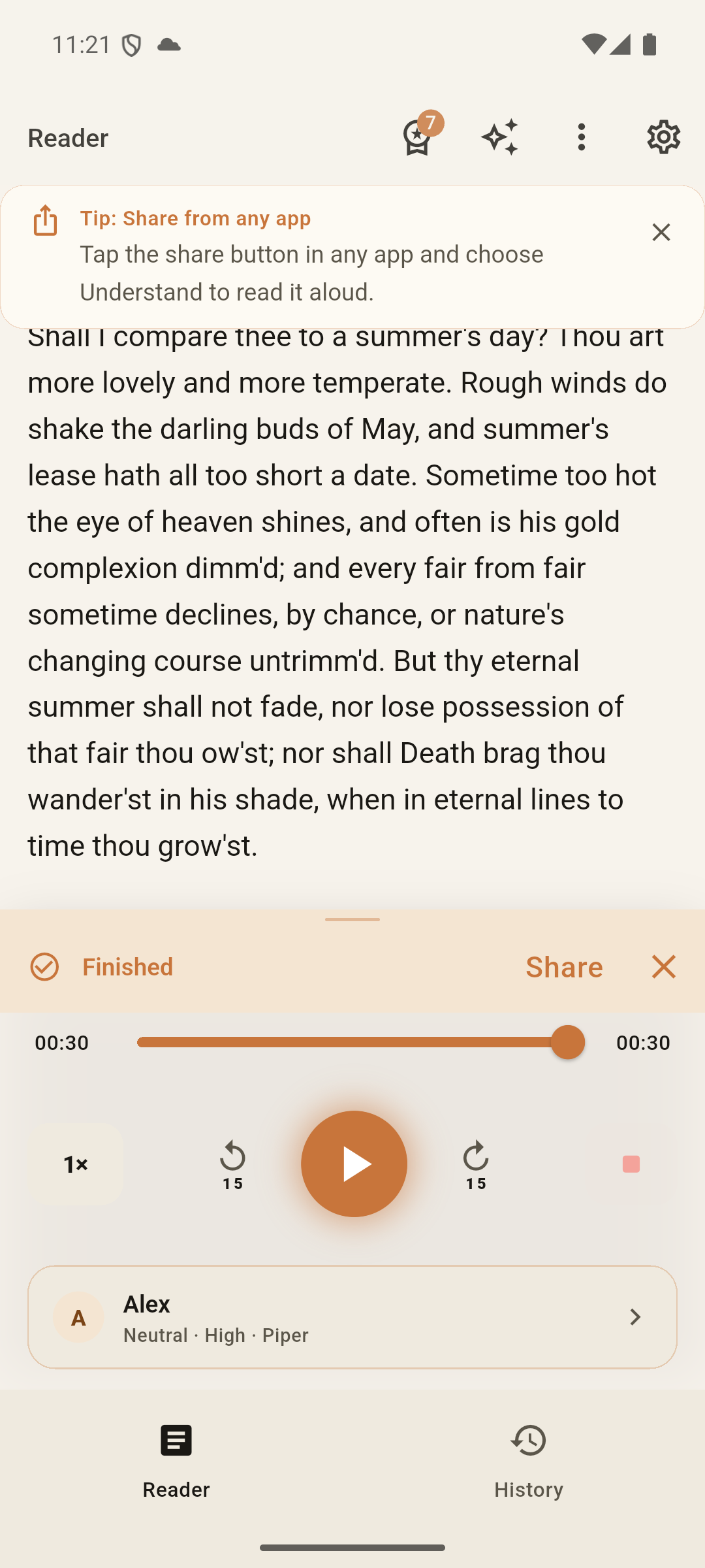
The real testing build pairs shared text with playback, speed, voice, and history controls. It is not the proposed visual direction shown later.
The earlier artifacts show how the design worked its way out of demo logic.
These two earlier states still matter because they make the correction visible: first a tiny sample-centered opening, then a fuller passage state that moved closer to the real product before the newer library-to-reader direction was proposed.
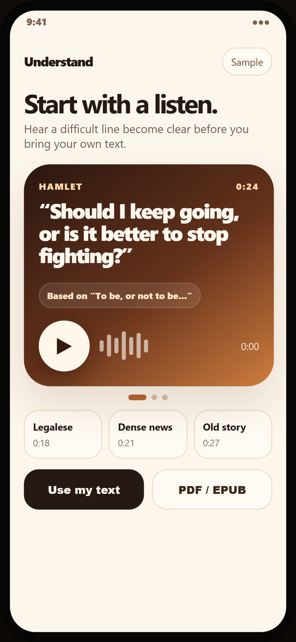
Quick proof of audio, but too much like a little sample instead of the start of a relationship with the text.
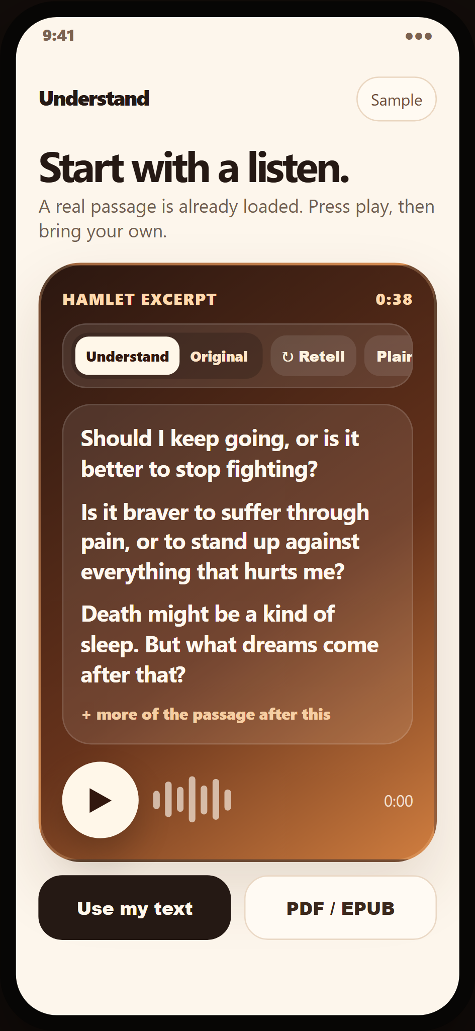
More text context. Closer to real use. Still clearly a bridge artifact on the way to a stronger product model.
The earlier version proved playback, but taught the wrong rhythm.
The user could tap, hear something, and understand the mechanic — but the experience still felt stop-start. It made the app read more like a novelty proof than an environment for sustained listening.
Whether a very fast playable sample could trigger the aha moment quickly enough to make the product click.
The sample got small too fast. The product felt compressed into the proof moment instead of opening into the work.
The next step made the text itself carry more of the experience.
V2 started moving the interaction closer to real reading/listening by giving the passage more room, more context, and less toy-demo energy. It also surfaced a deeper issue: the opening object had to generalize to real passages, documents, and books rather than just look good as a compressed sample.
The user could feel more clearly that they were inside a passage, not just hitting play on a one-off card.
It clarified the direction, but it still needed a more convincing app surface to feel like the product’s actual next shape.
The newer wireframes stop centering the sample and start centering the session.
The redesign direction argues for a structural change: the library becomes an entry point, the text view becomes the real destination, and the first interaction starts to imply a whole work the user can continue through. It is a product and design judgment about the app’s next shape.
Library → Play → text view → continue
That is the core structural move this study is defending. The newer wireframe screenshots show the entry and destination together. They are a proposed redesign being worked out after the functional testing build, not screens from that build.
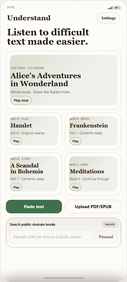
The proposed opening gives the user a book to continue, whole works to start, and immediate ways to bring their own text. The aim is to make first-run feel like entry into a durable product instead of a tiny teaser.
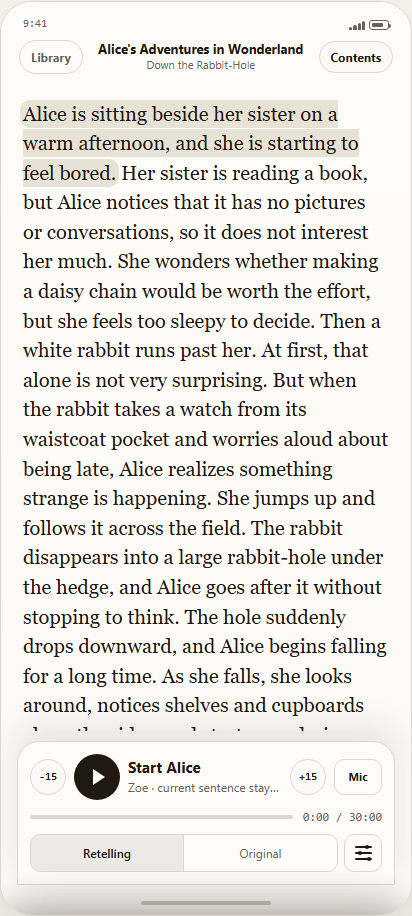
In the proposed reader, the book context stays visible and the listening controls stay close. The aim is to move from “tap a demo” to “start reading with audio help.”
The work started in Codex, then moved into Open Design when the wireframe work needed a better home.
Earlier design work happened directly inside Codex, which meant the same tool was jumping across visual design, structure, information architecture, and UX thinking at once. The process then shifted into Open Design — the open-source design tool — because it fit that job better and felt closer to how I had done UX work in the past: slower, clearer, and more focused on IA, big-picture structure, and layout.
Codex was helping directly with visual direction as well as structure, IA, and UX decisions. That made it useful for exploration, but it also blurred the boundary between design thinking and artifact-making.
Open Design gave the wireframe work a more natural place to live. It matches the newer design phase better: fewer old prototype links, more attention on the wireframes, the product model, and the structural questions that still need resolving.